The Challenge
iZoca Connect needed a professional logo to brand their marketing materials. They had signed up for a conference in Philadelphia and it was going to be their first opportunity to spark off a positive impression.
The Plan
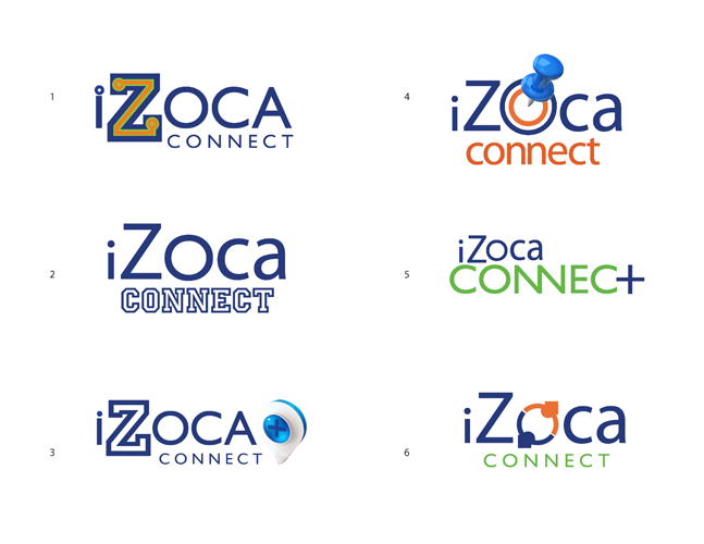
The look needed to evoke community and higher education. The new logo would leverage on the existing look and feel of the existing iZoca.com website.
The Solution
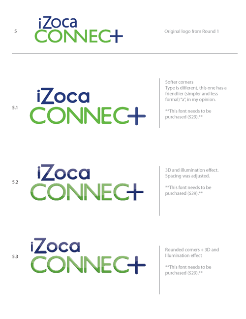
iZoca Connect kept the same colors as its parent logo. The emphasis is on the word CONNECT, to quickly differentiate it within the family of brands that iZoca is creating. The plus sign replaces the letter 'T' and works as an element that communicates an "addition" which is in essence what this software does. It is an Add-on to the standard LMS software in colleges and Universities.


