The Challenge
Gary Stine wanted to adjust his image to an audience that he knew very well, but that was not sticking with his current image. Gary wanted to appeal to his audience using a new company's name. He wanted to look corporate but still very approachable.
The Plan
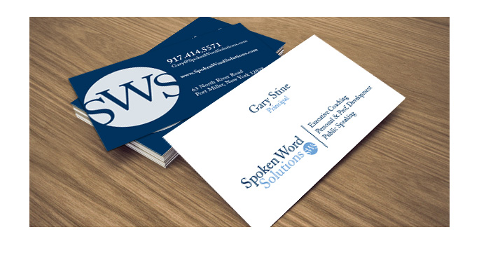
Explore traditional fonts and the use of a wordmark & symbol that provides the flexibility of using these elements together or separate.
The Solution
A beautiful Caslon type gives personality to this wordmark. The stylish capital letters work perfectly on a carved circle that also serves as an independent mark. The choice of blues makes the logo have a balance between a very corporate tone a a softer one.

